Risultati della ricerca
Tutte le categorie
Cancella
Cerca
Applica
Cerca in
Categoria
Ripristina
Filtra per
precedente
Avanti
Guide
Disconnettersi
Dashboard account
Seleziona la tua lingua
VIDEO
https://learning.squarespace.com
WEBINAR
https://forum.squarespace.com
FORUM
/hc/requests/new#choose-topic
Contattaci
CHAT LIVE: CHIUSA
CHAT LIVE: APERTA
Login
Visualizza tutti i risultati
Invia
Scegli un argomento
Potrebbe essere utile:
Hai ancora bisogno di contattarci?
Conversazioni in tempo reale e risposte immediate.
Chat Live
Dal lunedì al venerdì:
dalle 4:00 alle 20:00 EST
Inviaci un messaggio e leggi le nostre risposte quando preferisci.
Email
Contattaci via e-mail per ricevere aiuto con questo argomento.
24 ore al giorno
7 giorni la settimana
Accedi a Squarespace
Torna indietro
Questa guida non è ancora stata tradotta in italiano. Sarai reindirizzato alla versione inglese fra 5 secondi.
Attualmente offriamo supporto chat live solo in inglese.
ASSISTENZA VIA E-MAIL IN ITALIANO
CHAT IN INGLESE
Supporto Squarespace 5
Per domande sulla piattaforma legacy Squarespace 5, visita il Centro di Assistenza:
Indietro
Recupera l'accesso al tuo account o sito
Se hai provato a
recuperare il tuo account Squarespace o Acuity e non riesci ancora ad accedervi, siamo qui per aiutarti. Inserisci quante più informazioni puoi, ma se non hai la certezza di dettagli specifici, inserisci l'ipotesi migliore.
Prima di iniziare:
• Hai già provato a recuperare il tuo account tramite la pagina di login? Ti consigliamo di provare se non l'hai ancora fatto.
• Per la tua sicurezza, forniremo informazioni solo al titolare dell'account.
• Per assistenza nel recupero di un account Google Workspace, puoi contattarci qui.
L'indirizzo e-mail dove possiamo contattarti.
Quale situazione ha portato alla difficoltà di accesso al tuo account?
URL di qualsiasi website collegato all'account. Inserisci quanti più domini possibile.
Allega entrambi i seguenti documenti:
• Un documento d'identità rilasciato dallo Stato. Ad esempio, una patente di guida, un passaporto o un certificato di residenza permanente.
• Un estratto conto bancario che riporti l'intestazione della banca, il nome del titolare del conto bancario e l'addebito più recente di Squarespace. Puoi tranquillamente occultare le altre informazioni personali contenute nel documento. (Non richiesto per problemi con l'autenticazione a due fattori.)
Nota:
• Se hai inserito più siti Web qui sopra, allega gli estratti conto che mostrano l'addebito più recente associato a ogni sito.
• Accertati che i tuoi file siano .jpg o .png in modo che possiamo visualizzarli.
Richiedi l'accesso all'account
Segui questi step:
Maggiori informazioni
Richiedi un rimborso
Ricevi nostre notizie entro 2 giorni lavorativi.
Se disponi di un certificato di esenzione fiscale, allegalo qui. Sono accettati i formati file .pdf, .png, .jpeg .
Utilizza questo modulo per inviare una richiesta di esenzione dall'imposta sulle vendite riscossa per i pagamenti Squarespace.
Inserisci qui i dettagli della tua richiesta. Se non risiedi in uno dei Paesi in cui riscuotiamo tale imposta e credi che essa non dovrebbe essere applicata ai tuoi acquisti, fornisci dei chiarimenti.
Se hai commenti sulle nostre modalità di riscossione dell'imposta sulle vendite, inviali qui.
Il tuo feedback aiuta a rendere Squarespace sempre migliore e noi esaminiamo ogni richiesta ricevuta. Considera che non possiamo rispondere individualmente, tuttavia ti contatteremo nel caso in cui avessimo bisogno di maggiori dettagli.
Commenti generali relativi all'imposta sulle vendite
Richiedi l'esenzione dall'imposta sulle vendite
Dicci di più
Carica uno screenshot del problema che stai riscontrando o del contenuto del sito che desideri modificare, così da permetterci di aiutarti in modo più rapido. Scopri come acquisire uno screenshot, qui:
https://sqsp.link/hMaBjwSquarespace rispetta i diritti di proprietà intellettuale e richiede che i suoi utenti si comportino allo stesso modo. Squarespace risponde tempestivamente alle denunce di violazione del copyright commesse utilizzando i Servizi.
Per inviare una segnalazione di presunta violazione del copyright, è necessario utilizzare il modulo sottostante.
Nei casi in cui Squarespace svolga solo il ruolo di Registrar e non fornisca servizi di web hosting, Squarespace non esercita alcun controllo sui contenuti e questi non risiedono sui server di Squarespace. Di conseguenza, per risolvere il problema della violazione del copyright, sarà necessario rivolgersi direttamente al proprietario del sito o al fornitore del servizio di web hosting.
In risposta alle segnalazioni su presunte violazioni del copyright, Squarespace può rimuovere o limitare l'accesso al materiale in questione. Si noti che le informazioni fornite in una comunicazione di violazione del copyright possono essere inoltrate all'utente che ha pubblicato il contenuto potenzialmente violato o al proprietario del sito.
Squarespace si impegna a fornire ai propri clienti un servizio sicuro e affidabile. Se ritieni che su Squarespace siano presenti contenuti illeciti, ti preghiamo di inviare una segnalazione di contenuto illecito a Squarespace utilizzando il modulo sottostante. Abbiamo introdotto questo canale di segnalazione per i clienti in conformità con l'articolo 16 del Digital Services Act dell'Unione Europea (Regolamento (UE) 2022/2065) ("DSA").
Segnalazione di malware
Squarespace Domains LLC e Squarespace Domains II LLC si impegnano a fornire un servizio sicuro e affidabile. Se hai dei dubbi su un nome di dominio registrato con Squarespace, puoi inviarci una segnalazione.
Il malware, o software dannoso, è un programma progettato per interrompere, danneggiare o ottenere l'accesso a un computer all'insaputa del proprietario. Il malware include virus, spyware, ransomware e altri software indesiderati. Il malware utilizzato da più fonti viene definito botnet.
Per ulteriori informazioni sulla segnalazione di altre attività di dominio sospette a Squarespace, visita
Segnalare eventuali abusi di un dominio.
Prima di iniziare:
• Assicurati che il dominio che stai segnalando sia
registrato e gestito tramite Squarespace.
Visita i nostri
Termini di Servizio e la nostra
Politica d'uso accettabile per consultare le nostre politiche in materia di abusi e attività fraudolente o illegali.
Segnalazione di phishing o pharming
Squarespace Domains LLC e Squarespace Domains II LLC si impegnano a fornire un servizio sicuro e affidabile. Se hai dei dubbi su un nome di dominio registrato con Squarespace, puoi inviarci una segnalazione.
Il phishing è un tipo di frode che tenta di indurre gli utenti a condividere informazioni sensibili come i dati della carta di credito, le password o i dettagli dell'account.
Mentre il phishing tenta di indurre gli utenti a condividere informazioni sensibili, il pharming mira a reindirizzare gli utenti a siti fraudolenti tramite DNS modificato/hackerato, invece di dove l'utente intendeva andare in origine.
Per ulteriori informazioni sulla segnalazione di altre attività di dominio sospette a Squarespace, visita
Segnalare eventuali abusi di un dominio.
Prima di iniziare:
• Assicurati che il dominio che stai segnalando sia
registrato e gestito tramite Squarespace.
Visita i nostri
Termini di Servizio e la nostra
Politica d'uso accettabile per consultare le nostre politiche in materia di abusi e attività fraudolente o illegali.
Segnalazione di spam
Squarespace Domains LLC e Squarespace Domains II LLC si impegnano a fornire un servizio sicuro e affidabile. Se hai dei dubbi su un nome di dominio registrato con Squarespace, puoi inviarci una segnalazione.
Lo spam comprende tutte le e-mail massive non richieste inviate senza il consenso del destinatario. Ciò include lo "spamvertising" e l'invio di e-mail che violano il
CAN-SPAM Act.
Per ulteriori informazioni sulla segnalazione di altre attività di dominio sospette a Squarespace, visita
Segnalare eventuali abusi di un dominio.
Prima di iniziare:
• Assicurati che il dominio che stai segnalando sia
registrato e gestito tramite Squarespace.
Visita i nostri
Termini di Servizio e la nostra
Politica d'uso accettabile per consultare le nostre politiche in materia di abusi e attività fraudolente o illegali.
Testo temporaneo
Segnalazione di imprecisioni WHOIS
Squarespace Domains LLC e Squarespace Domains II LLC si impegnano a fornire un servizio sicuro e affidabile. Se hai dei dubbi su un nome di dominio registrato con Squarespace, puoi inviarci una segnalazione.
I proprietari di domini sono tenuti a mantenere aggiornati i propri record WHOIS. Tramite questo modulo è possibile segnalare dati di contatto del dominio inesatti, obsoleti o intenzionalmente falsi.
Per ulteriori informazioni sulla segnalazione di altre attività di dominio sospette a Squarespace, visita
Segnalare eventuali abusi di un dominio.
Prima di iniziare:
• Assicurati che il dominio che stai segnalando sia
registrato e gestito tramite Squarespace.
Visita i nostri
Termini di Servizio e la nostra
Politica d'uso accettabile per consultare le nostre politiche in materia di abusi e attività fraudolente o illegali.
Squarespace rispetta i diritti di proprietà intellettuale e si aspetta che i suoi utenti facciano lo stesso. Squarespace risponde prontamente alle segnalazioni di violazioni di marchio commesse durante l'utilizzo dei servizi. Per inviare una notifica di presunta violazione del marchio, è necessario inviare una notifica di violazione utilizzando il modulo sottostante.
Si prega di notare che nei casi in cui Squarespace è solo il registrar e non fornisce servizi di hosting web, Squarespace non controlla il contenuto e il contenuto non risiede nei server di Squarespace; sarà necessario risolvere la presunta violazione del marchio direttamente con il proprietario del sito o il fornitore del servizio di hosting web.
La risposta di Squarespace alle notifiche di presunta violazione del marchio può includere la rimozione o la restrizione dell'accesso al materiale che presumibilmente costituisce violazione. Le informazioni fornite in una notifica di violazione del marchio possono essere inoltrate all'utente che ha pubblicato il contenuto che presumibilmente viola il marchio o al proprietario del sito.
Compila tutti i campi obbligatori.
#
#
Squarespace Scheduling è diventato ufficialmente Acuity Scheduling. Per ricevere assistenza nell'organizzazione degli appuntamenti, cerca "Acuity" o consulta le guide correlate nella sezione "Acuity Scheduling".
#
#
Utilizza questo modulo per inviare una richiesta riguardante il sito o l'account Acuity Scheduling di un cliente Squarespace defunto. Porgiamo le nostre più sentite condoglianze a te e alla tua famiglia in questo triste momento e apprezziamo la sua pazienza mentre elaboriamo la sua richiesta.
A causa di problemi relativi alla privacy e di restrizioni, purtroppo non possiamo fornirti il controllo amministrativo del sito. Tuttavia, se un parente stretto o un rappresentante legale compila il modulo sottostante, potremmo essere in grado di concedere le autorizzazioni di fatturazione in modo che il sito possa rimanere attivo o annullare eventuali abbonamenti attivi.
Considera che le autorizzazioni di fatturazione non includono la possibilità di modificare il contenuto del sito. Puoi trovare maggiori informazioni
qui.
Nota relativa ai siti Squarespace 5:
Squarespace 5, la nostra piattaforma legacy, non consente la modifica delle autorizzazioni. Tuttavia, possiamo cancellare o rimuovere il sito.
Una nota relativa agli account Acuity Scheduling:
Non è possibile concedere le autorizzazioni di fatturazione sugli account Acuity senza un accesso Squarespace. Tuttavia, possiamo cancellare o rimuovere l'account.
Invia una richiesta sull'account di un cliente deceduto
Subject
Any comments, requests, or concerns we should know?
Please attach the following documents:
• An image of your government-issued ID, such as a driver’s license, passport, military ID, or permanent resident card. This is for proof of your relationship to the deceased.
• An image of the deceased person’s obituary, death certificate, and/or other documents.
• Any additional documents, such as Legal Representation documentation.
Inviaci un messaggio. Gli orari di apertura sono dal lunedì al venerdì, dalle 5:30 alle 20:00 EST. I messaggi inviati al di fuori di questi orari riceveranno una risposta entro 12 ore.
Dal lunedì al venerdì:
dalle 4:00 alle 20:00 EST
Centro assistenza Squarespace
Trova risposte e risorse
Vedi altri risultati
Sfoglia per prodotto
Website
Aggiungere contenuto con blocchi
Formattare le immagini per la visualizzazione
Modificare i colori
Lista di controllo SEO
Domini
Collegare un dominio
Spostamento di un dominio in un altro sito
Migrazione di Google Domains su Squarespace
Trasferimento di un dominio
Commerce
Aggiungere prodotti al tuo negozio
Connettere un elaboratore di pagamento
Creazione di sconti
Impostazione delle imposte
Campagne Email
Creare mailing list
Creare profili mittente
Procedure consigliate per le campagne e-mail
Guida introduttiva alle Campagne e-mail di Squarespace
Google Workspace
Utilizzare Google Workspace con Squarespace
Aggiunta di altri utenti di Google Workspace
Registrazione a Google Workspace
Rinominare un utente Google Workspace
Acuity Scheduling
Aggiungere Acuity al proprio sito web
Iniziare un periodo di prova di Acuity Scheduling
Creare e modificare i tipi di appuntamento
FAQ su Acuity Scheduling
Centro assistenza Acuity
Che cos'è Acuity Scheduling?
Prezzi, fatturazione e fatture di Acuity Scheduling
Aree membri
Creare contenuti riservati
Personalizzazione dell'esperienza Aree membri
Gestione dei membri
Guida introduttiva alle aree membri
Guide per argomento
Mostra di più
Mostra meno
Introduzione
Tutto ciò di cui hai bisogno per iniziare e lanciare il tuo sito su Squarespace
Account
Analytics
Ricevi assistenza per le impostazioni dell'account, la password e i collaboratori del sito
Pagamenti
Visualizza i rapporti per ottenere informazioni dettagliate sul coinvolgimento dei visitatori e sulle vendite
Ricevi assistenza con i tuoi piani, pagamenti e abbonamenti
Commerce
Scopri come configurare, gestire e far crescere il tuo negozio online
Domini
Ricevi assistenza dettagliata per la registrazione, il trasferimento e la connessione di domini
Google Workspace ed e-mail personalizzate
Immagini e video
Imposta un indirizzo e-mail personalizzato con il tuo dominio
Fai risaltare il tuo sito con immagini, video e banner
Integrazioni ed estensioni
Aggiungi integrazioni di terze parti per aiutarti a gestire, ottimizzare ed espandere il tuo sito
Marketing
Diffondi la voce sulla tua attività con gli strumenti di marketing all-in-one di Squarespace
Pagine e contenuto
Privacy e sicurezza
Scopri come creare e modificare il tuo sito con pagine, sezioni e blocchi
SEO
Ottieni informazioni su sicurezza, SSL, privacy dei dati e politiche su Squarespace
Scopri come ottimizzare il tuo sito per i motori di ricerca con le migliori parole chiave e contenuti
Acuity Scheduling
Prenota e gestisci gli appuntamenti con la prenotazione online integrata
Problemi tecnici e contatti
Risolvi i problemi tecnici e di velocità relativi al tuo sito
Modelli e design
Scopri come personalizzare tipi di carattere, colori e altre funzionalità di progettazione
Impara con il video
Tutto sulle immagini
7 video
Introduzione a Commerce
4 video
Crea il tuo primo sito Squarespace
1 video
Pagine e navigazione
7 video
Vedi tutti i video
Forum della community
Unisciti alla nostra community attiva di utenti e professionisti Squarespace per consigli, ispirazione e best practice.
Forum Squarespace
Webinar Squarespace
Forum Circle
Sessioni online gratuite dove imparerai le basi e perfezionerai le tue abilità Squarespace. Tutti sono i benvenuti, non è richiesto alcun sito Web.
Prossimi webinar
Assumi un esperto con Marketplace
Gli Squarespace Expert possono aiutarti a rifinire un sito esistente o crearne uno nuovo da zero.
Cerca un esperto
Non riesci a trovare quello che stai cercando?
Ti aiuteremo a trovare una risposta o ti metteremo in contatto con l'Assistenza clienti tramite chat live o e-mail.
Contattaci
Nessun risultato
Prodotti digitali
Guida introduttiva ai prodotti digitali
Paywall e piani tariffari
Pagine corso
Siti dei membri
Una persona con in mano uno smartphone che guarda il sito Web di Colima
Un esempio di sito Web Squarespace
Un esempio di nome dominio per un sito Web Squarespace
Uno screenshot della barra degli strumenti Google Workspace
Uno screenshot del prodotto Commerce nella piattaforma Squarespace
Un esempio di immagini per l'invio di campagne e-mail
Uno screenshot del prodotto Acuity nella piattaforma Squarespace
Uno screenshot dell'Aree membri nella piattaforma Squarespace
Una foto astratta di forme e colori
Un paio di scarpe bianche
Un iPad che mostra un sito Web di e-commerce creato con Squarespace
Una persona con in mano uno smartphone che guarda un sito Web creato con Squarespace
Uno screenshot degli strumenti di modifica sulla piattaforma Squarespace
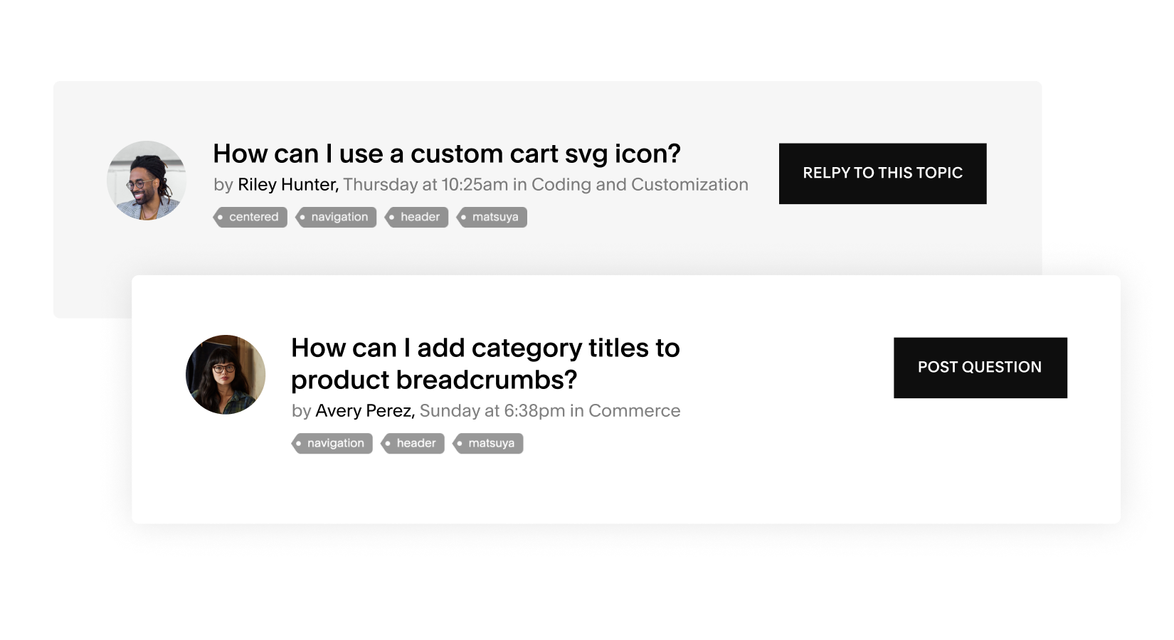
Esempi di domande sul forum della community di Squarespace
Un esempio di biografia di uno Squarespace Expert
Un sito Web Squarespace con il chatbot del servizio clienti Squarespace aperto sullo schermo
Chiudi
Come valuteresti la tua esperienza con il Centro assistenza?
Piuttosto insoddisfatto
Molto insoddisfatto
Né soddisfatto né insoddisfatto
Piuttosto soddisfatto
Feedback
Molto soddisfatto
Avanti
Puoi spiegarci il motivo? (Facoltativo)
Com'è stata la tua esperienza nel cercare aiuto oggi?
Molto difficile
Piuttosto difficile
Né facile né difficile
Piuttosto facile
Molto facile
Perché? (Facoltativo)
Non sono sicuro
Hai trovato la risposta che cercavi nel Centro assistenza?
No, il mio problema non è stato risolto
L'ho trovato altrove
Sì, in parte
Sì, completamente
Dove hai trovato la risposta migliore?
Seleziona
Video
Guida
Webinar
Forum
Altro
Grazie per il tuo feedback
Impossibile scaricare la trascrizione. Riprova.
We use machine translation to translate guides in this language. Human editors don’t review the content for quality after it’s translated.
Read the English version
Acuity Scheduling
Non riesci ad accedere?
Non ho un account
Login
Accedi al tuo account per personalizzare la tua esperienza.
Per quale account hai bisogno di aiuto oggi?
Forum Community
Ricevi assistenza dalla nostra community in merito alle personalizzazioni avanzate.
Esplora il Forum
Webinar
Iscriviti a una sessione interattiva durante la quale i nostri esperti ti aiuteranno a comprendere le basi di Squarespace.
Partecipa a un webinar
Non riesci a trovare quello che stai cercando?
Ti aiuteremo a trovare la risposta o a metterti in contatto con un consulente.
Contattaci
Ricevi assistenza dalla nostra community
Ricevi assistenza dalla nostra community in merito alle personalizzazioni avanzate.
cerca nei forum
Affidati a uno Squarespace Expert
Fatti notare online con l'aiuto di un designer o di uno sviluppatore esperto.
trova l'esperto che fa per te
In questa guida
La guida è stata utile?
Le persone hanno visto anche
Accesso a questa funzionalità
Nota
Suggerimento
Avviso
Hai trovato le informazioni che stavi cercando?
Sto ancora navigando
Grazie per il feedback.
Errore di copia del testo negli appunti
Testo copiato correttamente negli appunti
Copia
In questa guida
Il tuo modulo è stato inviato correttamente!
È stata inviata un'e-mail di conferma al tuo indirizzo. Ti risponderemo il prima possibile.
torna su Squarespace
Non riesci a trovare quello che ti serve?Ecco come puoi contattarci.
Inviaci una e-mail
Chat dal vivo
Inviaci un messaggio e leggi la nostra risposta quando preferisci.
Conversazioni in tempo reale e risposte immediate dal nostro pluripremiato team di assistenza clienti.
24 ore al giorno
7 giorni alla settimana
Dal lunedì al venerdì
dalle 4:00 alle 20:00 EST
Da lunedì a venerdì
dalle 4:00 alle 20:00 EDT
invia un'e-mail
avvia la chat dal vivo
Chat dal vivo attualmente non disponibile.
{"schedules":[{"id":50095,"name":"Business Hours","time_zone":"Eastern Time (US & Canada)","created_at":"2014-10-03T22:10:16Z","updated_at":"2025-01-06T14:24:27Z","intervals":[{"start_time":1200,"end_time":1440},{"start_time":1440,"end_time":2880},{"start_time":2880,"end_time":4320},{"start_time":4320,"end_time":5760},{"start_time":5760,"end_time":7200},{"start_time":7200,"end_time":8400}]},{"id":360000418191,"name":"Social Team Hours","time_zone":"Eastern Time (US & Canada)","created_at":"2020-09-01T09:34:47Z","updated_at":"2020-09-03T13:07:03Z","intervals":[{"start_time":240,"end_time":1440},{"start_time":1680,"end_time":2880},{"start_time":3120,"end_time":4320},{"start_time":4560,"end_time":5760},{"start_time":6000,"end_time":7200},{"start_time":7440,"end_time":8640},{"start_time":8880,"end_time":10080}]},{"id":360000421112,"name":"Account Management VIP Hours","time_zone":"Eastern Time (US & Canada)","created_at":"2020-09-29T20:18:51Z","updated_at":"2021-03-03T10:38:13Z","intervals":[{"start_time":1440,"end_time":2880},{"start_time":2880,"end_time":4320},{"start_time":4320,"end_time":5760},{"start_time":5760,"end_time":7200},{"start_time":7200,"end_time":8640}]},{"id":5995548166541,"name":"Live Chat Business Hours","time_zone":"Eastern Time (US & Canada)","created_at":"2022-05-04T15:10:42Z","updated_at":"2025-03-13T17:10:07Z","intervals":[{"start_time":1680,"end_time":2640},{"start_time":3120,"end_time":4080},{"start_time":4560,"end_time":5520},{"start_time":6000,"end_time":6960},{"start_time":7440,"end_time":8400}]},{"id":5995587746445,"name":"Live Chat AUS/NZ Hours","time_zone":"Eastern Time (US & Canada)","created_at":"2022-05-04T15:12:38Z","updated_at":"2025-03-13T17:10:15Z","intervals":[{"start_time":1200,"end_time":1440},{"start_time":1440,"end_time":2880},{"start_time":2880,"end_time":4320},{"start_time":4320,"end_time":5760},{"start_time":5760,"end_time":7200},{"start_time":7200,"end_time":8400}]},{"id":18405093826701,"name":"[Inactive] Live Chat Acuity Hours","time_zone":"Eastern Time (US & Canada)","created_at":"2023-08-10T16:06:56Z","updated_at":"2024-04-29T14:57:38Z","intervals":[{"start_time":1680,"end_time":2610},{"start_time":3120,"end_time":4050},{"start_time":4560,"end_time":4920},{"start_time":5220,"end_time":5340},{"start_time":5400,"end_time":5490},{"start_time":6000,"end_time":6360},{"start_time":6420,"end_time":6600},{"start_time":6660,"end_time":6780},{"start_time":6840,"end_time":6930},{"start_time":7440,"end_time":8370}]},{"id":21322019776781,"name":"Email - IntouchCX (COSO-3757)","time_zone":"Eastern Time (US & Canada)","created_at":"2023-11-14T14:54:21Z","updated_at":"2024-04-29T14:59:04Z","intervals":[{"start_time":960,"end_time":1440},{"start_time":1440,"end_time":2880},{"start_time":2880,"end_time":4320},{"start_time":4320,"end_time":5760},{"start_time":5760,"end_time":7200},{"start_time":7200,"end_time":7980}]},{"id":21322160612877,"name":"Email - 24/7 teams (COSO-3757)","time_zone":"Eastern Time (US & Canada)","created_at":"2023-11-14T14:59:39Z","updated_at":"2024-04-29T14:59:13Z","intervals":[{"start_time":0,"end_time":1440},{"start_time":1440,"end_time":2880},{"start_time":2880,"end_time":4320},{"start_time":4320,"end_time":5760},{"start_time":5760,"end_time":7200},{"start_time":7200,"end_time":8640},{"start_time":8640,"end_time":10080}]},{"id":25217370917901,"name":"Product Support Business Hours","time_zone":"Eastern Time (US & Canada)","created_at":"2024-03-21T17:12:42Z","updated_at":"2024-05-07T11:37:22Z","intervals":[{"start_time":1620,"end_time":2700},{"start_time":3060,"end_time":4140},{"start_time":4500,"end_time":5580},{"start_time":5940,"end_time":7020},{"start_time":7380,"end_time":8460}]},{"id":26294188481165,"name":"Live Chat - CUSU & HVCS (COSO-4219)","time_zone":"Eastern Time (US & Canada)","created_at":"2024-04-29T14:59:37Z","updated_at":"2025-03-13T17:10:25Z","intervals":[{"start_time":1680,"end_time":2640},{"start_time":3120,"end_time":4080},{"start_time":4560,"end_time":5520},{"start_time":6000,"end_time":6960},{"start_time":7440,"end_time":8400}]},{"id":28799929362829,"name":"Live Chat - Acuity","time_zone":"Eastern Time (US & Canada)","created_at":"2024-07-29T17:52:26Z","updated_at":"2025-03-13T17:10:35Z","intervals":[{"start_time":1680,"end_time":2640},{"start_time":3120,"end_time":4080},{"start_time":4560,"end_time":5520},{"start_time":6000,"end_time":6960},{"start_time":7440,"end_time":8400}]}],"url":"https://squarespace.zendesk.com/api/v2/business_hours/schedules"}
Squarespace Payments
Area prodotti Squarespace Payments
Introduzione a Squarespace Payments
Versamenti di Squarespace Payments
Cosa succede in caso di saldo negativo con Squarespace Payments
Gestire il proprio account Squarespace Payments
Accettare pagamenti
Scopri come elaborare le transazioni quando vendi i tuoi prodotti su Squarespace
Pagamento completato
Si è verificato un errore durante l'elaborazione della tua azione. Riprova.
Messaggio non recapitato. Clicca per riprovare.
Si è verificato un errore durante l'elaborazione della carta.
Riprova o di utilizza un'altra carta.
Modulo non inviato. Clicca su un punto qualsiasi del modulo per riprovare.
Sincronizza la conversazione e continua a inviarci messaggi con la tua app preferita.
Ricevi una notifica in caso di risposta.
Le mie conversazioni
1 minuto fa
Proprio ora
{value} minuti fa
1 ora fa
{value} ore fa
Ieri
DD/MM/YY
{user} ha inviato un messaggio
Qualcuno
{user} ha inviato un file
{user} ha inviato un modulo
{user} ha inviato un'immagine
{user} ha compilato un modulo
{user} ha inviato una richiesta di localizzazione
Te
DD MMMM YYYY, hh:mm A
Riconnessione...
Connessione ripristinata.
Offline. Non riceverai i messaggi.
Impossibile caricare le conversazioni.
Cambia il mio indirizzo e-mail
Per ricevere una notifica via e-mail al ricevimento di una risposta, inserisci il tuo indirizzo di posta elettronica.
Email
Il tuo indirizzo e-mail
Inserisci un indirizzo e-mail valido.
Invia
Carica altro
Recupero della cronologia...
Limite di dimensione massima del file superato ({size})
Questa voce è obbligatoria
Tipo di file non supportato.
L'e-mail non è valida
Deve contenere almeno ({characters}) caratteri
Non deve contenere più di ({characters}) caratteri
Fai una scelta...
Sembra che ci sia un problema
Per contattarci via e-mail basta inviare un messaggio al nostro indirizzo di posta elettronica e ti risponderemo entro poco tempo:
Come possiamo aiutarti?
Clicca per ricaricare l'immagine.
Clicca per visualizzare l'immagine {size}.
Digita un messaggio...
Anteprima non disponibile.
Inviaci un messaggio qui sotto o tramite la tua app preferita.
Premi INVIO per ogni voce
Si è verificato un errore nel tentativo di generare un link per questo canale. Riprova.
Per contattarci tramite LINE, effettua la scansione di questo codice QR utilizzando l'app LINE e inviaci un messaggio.
Sincronizza la conversazione
Il tuo browser non supporta i servizi di localizzazione oppure sono stati disattivati. Indica la tua posizione.
Questo sito web non può accedere alla tua posizione. Digita la tua posizione.
Impossibile inviare la posizione
Questo sito web non può accedere alla tua posizione. Consenti l'accesso nelle impostazioni o digita la tua posizione.
Si è verificato un errore durante l'invio del messaggio. Riprova.
({count}) nuovi messaggi
{value} giorno/i fa
({count}) nuovo messaggio
Proprio ora
{value} minuto/i fa
{value} ora/e fa
Consegna effettuata
hh:mm A
Letto
La dimensione massima del messaggio è stata superata ({size}).
Invio in corso...
Sincronizza questa conversazione effettuando la connessione alla tua app di messaggistica preferita per proseguire la conversazione come preferisci.
Collega il tuo account Facebook Messenger per ricevere una notifica quando ricevi una risposta e continuare la conversazione su quest'ultimo.
Nuova conversazione
Altri canali
Connessione effettuata
Salve 👋\nPer prima cosa, vorremmo chiederti qualche informazione in più su di te:
Connessione effettuata come {username}
Il tuo nome
Email
Digita il tuo nome...
Grazie! Come possiamo aiutarti?
nome@azienda.com
Invia
Ti invieremo una notifica qui e via e-mail all'indirizzo {email} non appena avremo risposto.
Impostazioni
Posizione
Annulla
Non siamo riusciti a contattare questo numero. Riprova o usane uno diverso.
Collega il tuo numero di telefono per ricevere una notifica quando ricevi una risposta e continuare la conversazione via SMS.
Cambia il mio numero
Per confermare il tuo numero di telefono, controlla la presenza di nuovi messaggi sul numero {number}.
Inserisci un numero di telefono valido.
Invia
Il collegamento a {appUserNumber} è stato annullato.
In sospeso
Inizia a scrivere
Si è verificato un errore durante l'invio di un messaggio al tuo numero.
Inviami un SMS
Di recente è stata richiesta una connessione per quel numero. Riprova tra 1 minuto.
Di recente è stata richiesta una connessione per quel numero. Riprova tra {minuti} minuti.
Sincronizza la conversazione
Si è verificato un errore. Riprova.
Messaggio non recapitato. Tocca per riprovare.
Modulo non inviato. Tocca un punto qualsiasi del modulo per riprovare.
Collega il tuo account Telegram per ricevere una notifica quando ricevi una risposta e continuare la conversazione su quest'ultimo.
Tipo di messaggio non supportato.
Tipo di azione non supportato.
File
File non valido.
Immagine
Il tuo file contiene un virus ed è stato rifiutato
Collega il tuo account Viber per ricevere una notifica quando ricevi una risposta e continuare la conversazione su quest'ultima. Per iniziare, effettua la scansione del codice QR utilizzando l'app Viber.
Collega il tuo account Viber per ricevere una notifica quando ricevi una risposta e continuare la conversazione su quest'ultima. Per iniziare, installa l'app Viber e tocca Connetti.
Si è verificato un errore durante l'acquisizione del codice QR di Viber. Riprova.
Collega il tuo account WeChat per ricevere una notifica quando ricevi una risposta e continuare la conversazione su quest'ultima. Per iniziare, effettua la scansione del codice QR utilizzando l'app WeChat.
Si è verificato un errore durante il recupero del codice QR di WeChat. Riprova.
Collega il tuo account WeChat per ricevere una notifica quando ricevi una risposta e continuare la conversazione su quest'ultima. Per iniziare, effettua la scansione del codice QR utilizzando l'app WeChat. Per iniziare, salva l'immagine di questo codice QR e caricala nello <a href=\'weixin://dl/scan\'>scanner di codici QR.
Sincronizza il tuo account su WhatsApp tramite la scansione del codice QR o cliccando sul link in basso.\nIn seguito, invia il messaggio precompilato per confermare la richiesta di sincronizzazione. (Il tuo codice: {{code}})
Sincronizza il tuo account su WhatsApp cliccando sul link in basso.\nIn seguito, invia il messaggio precompilato per confermare la richiesta di sincronizzazione. (Il tuo codice: {{code}})
Si è verificato un errore durante il recupero delle informazioni sul collegamento di WhatsApp. Riprova.
L'operazione potrebbe richiedere alcuni minuti.
Non è necessario attendere nella coda della chat per ricevere una risposta. Invierò la tua trascrizione al nostro team. Ti risponderemo via e-mail il prima possibile.
In questo modo uscirai dalla coda della chat e perderai il tuo posto in coda. Puoi tornare in coda in qualsiasi momento aprendo una nuova chat.
Nessuna modalità trovata
In attesa di un agente...
Inviare un'e-mail?
Annullare la richiesta di chat?
Annulla chat
Invia e-mail
Conferma
Invia un'e-mail
Continua ad attendere
Assistente Squarespace
Visualizza stato della coda
Il supporto chat live per questa lingua è attualmente offline.
Il chatbot non funziona?
Segnalalo al nostro team.
Ciao
ti aiuterò ad avere l'aiuto di cui hai bisogno.
Il nostro assistente automatizzato si metterà al lavoro per trovare una risposta rapida.
Vuoi parlare con una persona reale? L'assistente di supporto può metterti in contatto con un membro del nostro team tramite live chat o e-mail.
contattaci
Come ottenere aiuto
Inizia con il nostro Assistente di supporto automatico
Ricevi risposte rapide dal nostro chatbot in qualsiasi momento. Digita la tua domanda e riceverai subito assistenza.
Invia un'e-mail o chatta con il nostro team di assistenza
Hai bisogno di aiuto? Il nostro Assistente di supporto ti metterà in contatto con un consulente del nostro team di assistenza clienti.
Ti aiuterò ad avere l'aiuto di cui hai bisogno.
Accedi per ricevere assistenza con maggiore rapidità.
La chat dal vivo non è disponibile
Chatta in inglese
Chat Live
La chat dal vivo non è attualmente disponibile. Inviaci un'e-mail e ti risponderemo entro 12 ore.
Al momento, la chat dal vivo non è disponibile nella tua lingua. Chatta con noi in inglese, oppure inviaci un'e-mail e ti risponderemo entro 12 ore.
La chat dal vivo è disponibile nella tua lingua dal lunedì al venerdì, dalle 10:00 alle 16:00 CET.
La chat dal vivo non è disponibile nella tua lingua. Inviaci un'e-mail e ti risponderemo entro 12 ore.
La chat dal vivo non è disponibile nella tua lingua. Chatta con noi in inglese, oppure inviaci un'e-mail e ti risponderemo entro 12 ore.
Conversazioni in tempo reale e risposte immediate dal nostro pluripremiato team di assistenza clienti.
Dal lunedì al venerdì, dalle 10:00 alle 16:00 CET
La chat dal vivo non è attualmente disponibile. Inviaci un'e-mail e ti risponderemo entro 12 ore.
La chat dal vivo è disponibile nella tua lingua dal lunedì al venerdì, dalle 10:00 alle 16:00 CET.
Vai alla chat